High bounce rate. Three words marketers fear more than anything. (And for good reason.) Unfortunately, if you can’t keep people on your website, then you won’t convert clicks and smash sales.
But the good news? It only takes a few tweaks to get your website firing on all cylinders.
Here’s how you can do exactly that.
Create clear navigation
Step one on your journey to better web design? Create clear navigation for your visitors. This will ensure that anyone who lands on your site has the best possible experience. As a result – they’ll be more likely to engage with your content and services.
Do this by making your layout simple and logical. For instance, you want people to be able to move around in a way that makes sense for them. So rejig your wire frame if needed, and implement smarter tabs to make clicking around a breeze.
Here are some other things to consider:
- Make your homepage a roadmap for the rest of your site
- Label your tabs clearly so visitors know what to expect on each page
- Add internal links to make it easy to move from one section to another
- Remove dead ends and roadblocks
Break up large slabs of text
Content is an amazing tool. But if you have too much – or endless slabs of text – you’re in for a world of trouble. Basically, lots of words on a page can be intimidating. And if a section is difficult to read, then your customers will either avoid it or click away altogether.
The remedy? Break things up. Have no more than 4 lines per paragraph. And make your content easy for readers to digest.
Use colour, white space and contrast effectively
One way to separate large slabs of text up is by using white space. In short, you can give your words and images room to breathe just by hitting enter on your keyboard. This makes your content more appealing and less intense.
So add white space between content blocks wherever you can. And remember, you have other tools at your disposal, too. Play with contrasting colours to draw the eye and watch as dense pages become a joy to peruse.
Make your website easy to scan
Everyone is busy. And like it or not – our attention spans are shrinking by the year. This means most of your visitors won’t even read your content in full, or take the time to appreciate your beautiful images.
So make your website scannable. In other words, think about the human eye: it floats and flutters across a page and then quickly homes in when it finds something interesting.
Capitalise on this. Write strong headings. Add bold videos and images. And watch as your content really starts to sing.
Remember, you have only three seconds to grab someone’s attention. So make it count.
Have fun with user interaction
Want your website to truly stand out? Get creative with interactive effects. For instance, you can add cool scroll over features or instant play videos. Or you can add a pop-up chatbot that directs visitors to your help section if they seem lost.
Additions like these might seem small, but they can make a world of difference to your user experience. And at the end of the day, that’s the key to improving your bounce rate.
Add a killer CTA
Okay. It’s time to create your all-important CTA (or Call to Action). This should be creative, engaging and specific to the page at hand. So write copy that will tempt someone to make a purchase, sign up for a course or whatever your goal may be.
Then, position your CTA in a prominent location so it stands out. And use white space and contrast to really make it pop.
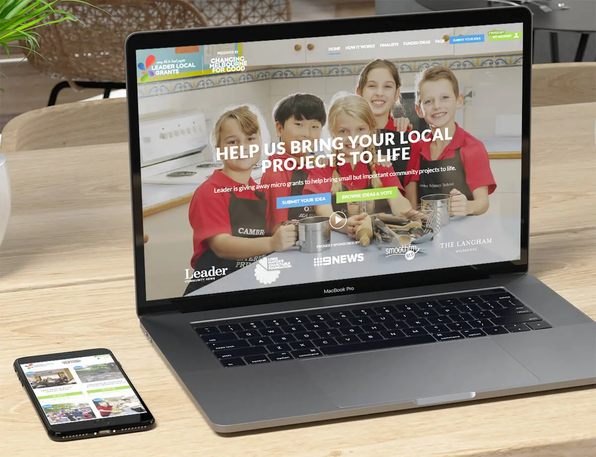
Need an example? Check out ours below.
Want to keep visitors on your site for longer? We’re here to help.
At Vibes Design, we take our clients’ websites from good to great. And with the best tools by our sides, we promise to make your bad bounce rate a thing of the past.
Connect with us today and let’s discuss your needs.